Sixways & Warriors
Stadium & Club Website System
One system, two sites, one club.
Worcester Warriors needed two websites that work as a pair: Sixways, the stadium’s venue-hire and events site, and Warriors, the rugby club itself. Working on this as part of the team at HTDL, I got to design the look and feel for both, building a shared visual system flexible enough to serve a corporate events venue and a sports club, while keeping the two brands feeling like part of the same family.
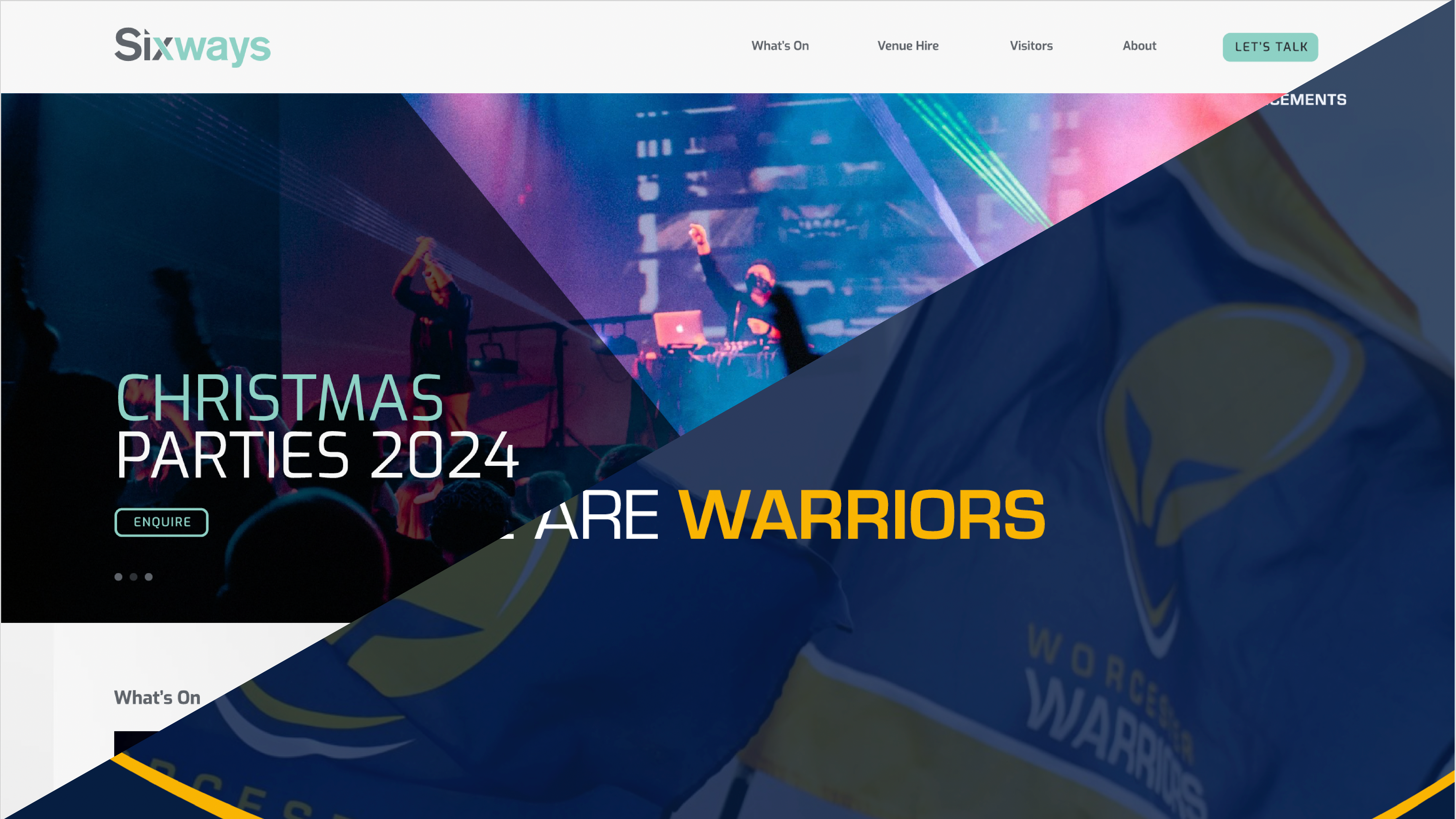
![Sixways homepage hero: “Your Venue Your Way”, with the stadium nav and primary call to action.]
Two audiences, one address.
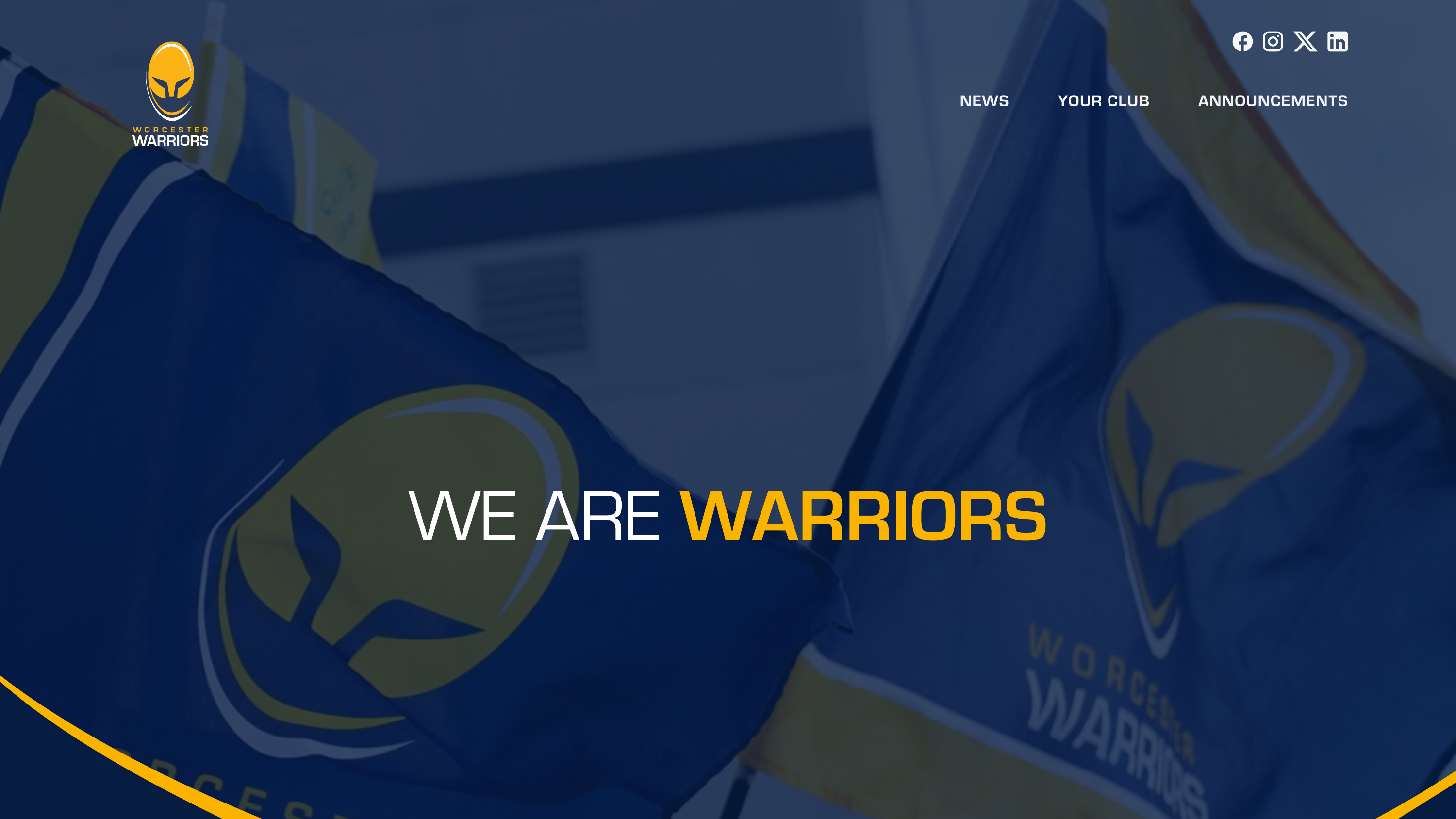
Sixways Stadium is the venue: it markets meeting spaces, conferences, and events like the Big 80s Bash and Christmas parties to corporate and private hirers. Warriors is the rugby club that plays there: news, fixtures, club history, and community content for supporters. Different audiences, different goals, but the same building, the same brand family, and in practice the same visitors moving between the two.
The brief was to give each site its own identity while making it obvious they belong together.
Building the shared system first.
Rather than designing each site from scratch, I started with the components both sites would need: navigation and link states, button variants, accordions, news/event cards, and forms. Getting these right once meant every page on both sites (homepages, listings, generic content pages) could be assembled consistently.
From there, I made three structural decisions:
- One component library, two palettes: Buttons, cards, accordions, and form fields share the same shapes, spacing, and states, but Sixways runs on a teal/mint palette while Warriors uses navy and gold, so each site reads as its own brand without diverging in structure.
- A reusable content template: Both sites needed news articles, “what’s on” listings, and informational pages (club history, venue policies). I designed a single flexible template (header, lead copy, accordions, and a linked sidebar) that covers all of these with just content swapped in.
- Shared footer as the connective thread: Every page on both sites carries both the Sixways and Warriors crests, social links, and a newsletter signup. Wherever a visitor lands, the footer makes the relationship between venue and club explicit.
![Component system: button variants, accordion styles, link states, and news card layouts shared across both sites.]
Same bones, different brand.
The “What’s On” cards on Sixways and the “Latest News” cards on Warriors use the same underlying card component (image, eyebrow heading, date, copy, and CTA), but Sixways leans on bright event photography and a teal accent, while Warriors uses match-day photography with the club’s navy-and-gold identity. The accordion component follows the same pattern: identical interaction and structure, restyled per brand.
What this project demonstrates.
Design systems thinking: A single component library serving two distinct brands and audiences, without either feeling like an afterthought.
Working within an existing brand family: Designing for a club and its stadium meant every decision had to reinforce that these are two faces of one organisation, not two unrelated sites.
Agency delivery: Designed as part of a client engagement at HTDL, working to existing brand guidelines and handing off component specs ready for development.
Working across two brands at once taught me a lot about building systems that flex without breaking, exactly the kind of challenge I want more of.