Reconmatic
Dashboard UI
Turning a developer tool into a product people can actually use.
Reconmatic is a decarbonisation platform for the UK construction sector. I was contracted by the University of Salford to redesign the dashboard from the ground up, and it was a brief I loved: turning a raw, hard-to-use interface into something clear, navigable, and genuinely nice to use.
A tool built for engineers, not users.
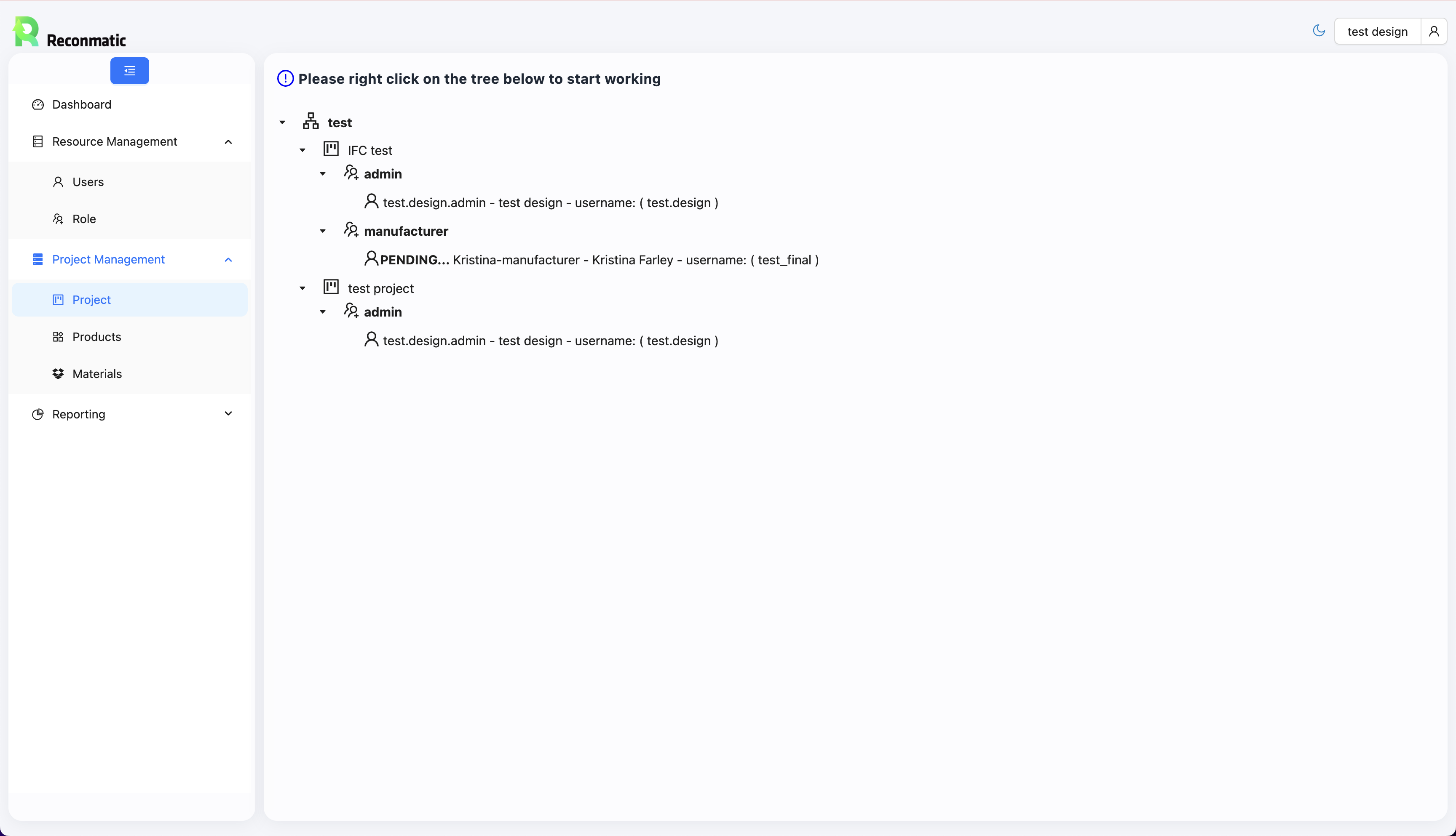
Construction project managers are time-pressured, site-focused, and not interested in learning software. The existing Reconmatic interface presented project data as a collapsible tree with no visual hierarchy, no status at a glance, and a prompt telling users to “right click to start working.” It was functional under the hood, but invisible in practice.
The brief was clear: make it usable.
Start with the user, not the data.
Before touching Figma, I mapped the key journeys a project manager would actually need: finding an active project, checking team status, reviewing progress. That gave me three problems to solve: confused navigation, unreadable data presentation, and a visual language that communicated nothing about the product or its purpose.
From there, I made three structural decisions:
- Navigation restructured: A persistent sidebar with six clear sections (Dashboard, Projects, Products, Materials, Users, Settings), giving users a consistent mental model of the system at all times.
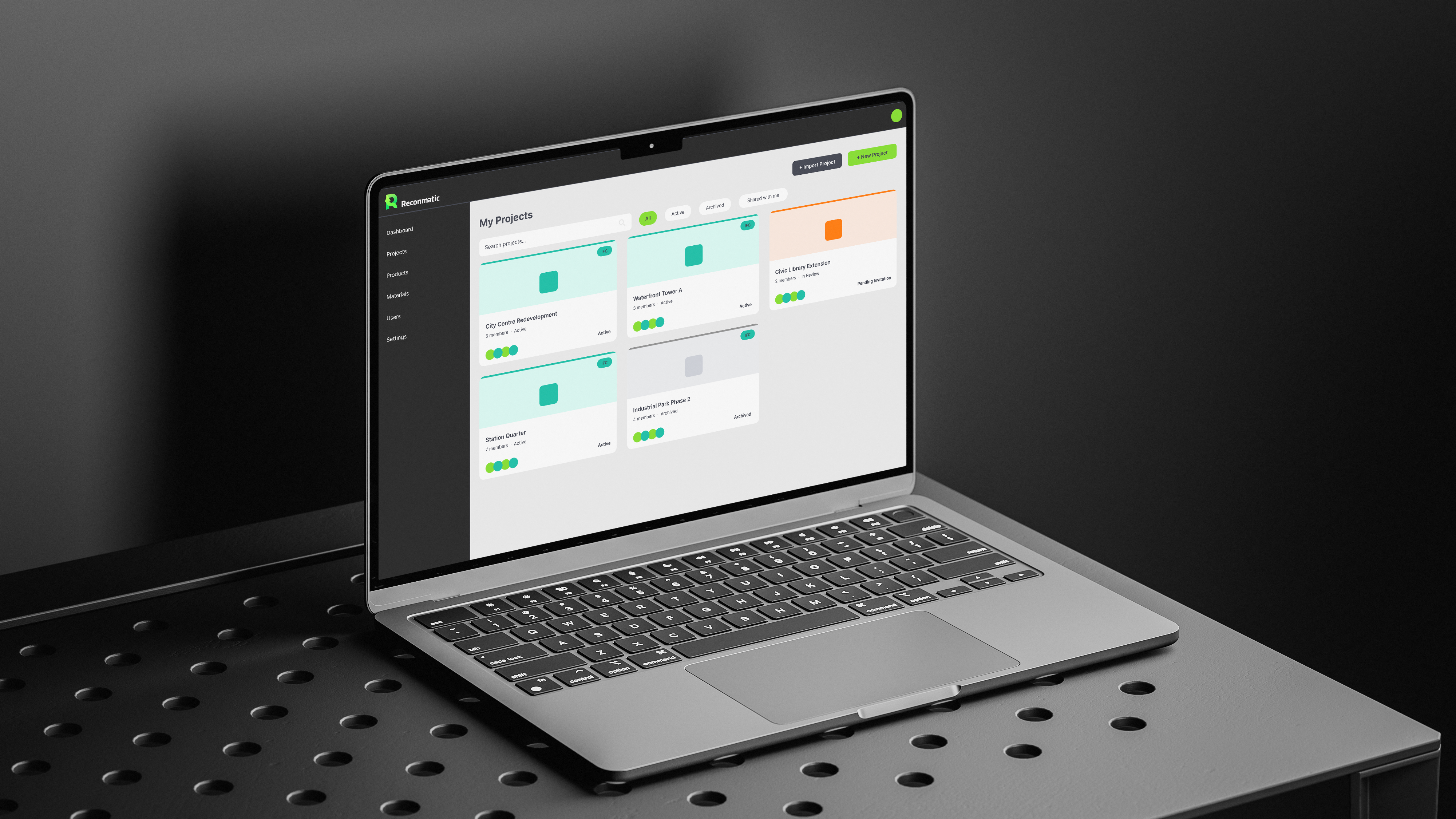
- Cards replace trees: Project data moved from collapsible text rows into scannable cards with colour-coded status borders. Active, archived, and pending projects are distinguishable at a glance.
- Consistent visual system: A clear colour, type, and spacing system applied throughout the dashboard, so status, hierarchy, and actions read consistently across every screen, turning a prototype into a product that earns trust.
From prototype to product-ready.
The redesigned interface gave project managers a dashboard they could scan, navigate, and understand without instruction, and the development team received complete high-fidelity wireframes, covering user flows, component states, layout, colour, and typography, ready to build from.
The project was paused due to funding constraints before reaching development, but the design work stands as a complete first iteration, and one I’m proud of: a clear example of what user-centred thinking looks like when applied to a complex B2B tool.
If the project continued.
- Run usability testing with construction project managers to validate the navigation model
- Design the Dashboard home screen with emissions tracking data visualisations
- Build out Materials and Products screens using the same card-based component system
- Establish a full Figma component library to support design at scale
It’s exactly the kind of brief I love: messy, real, and full of opportunities to learn from how people actually work.