Harvest Communications
Website
Building a company’s digital presence from nothing.
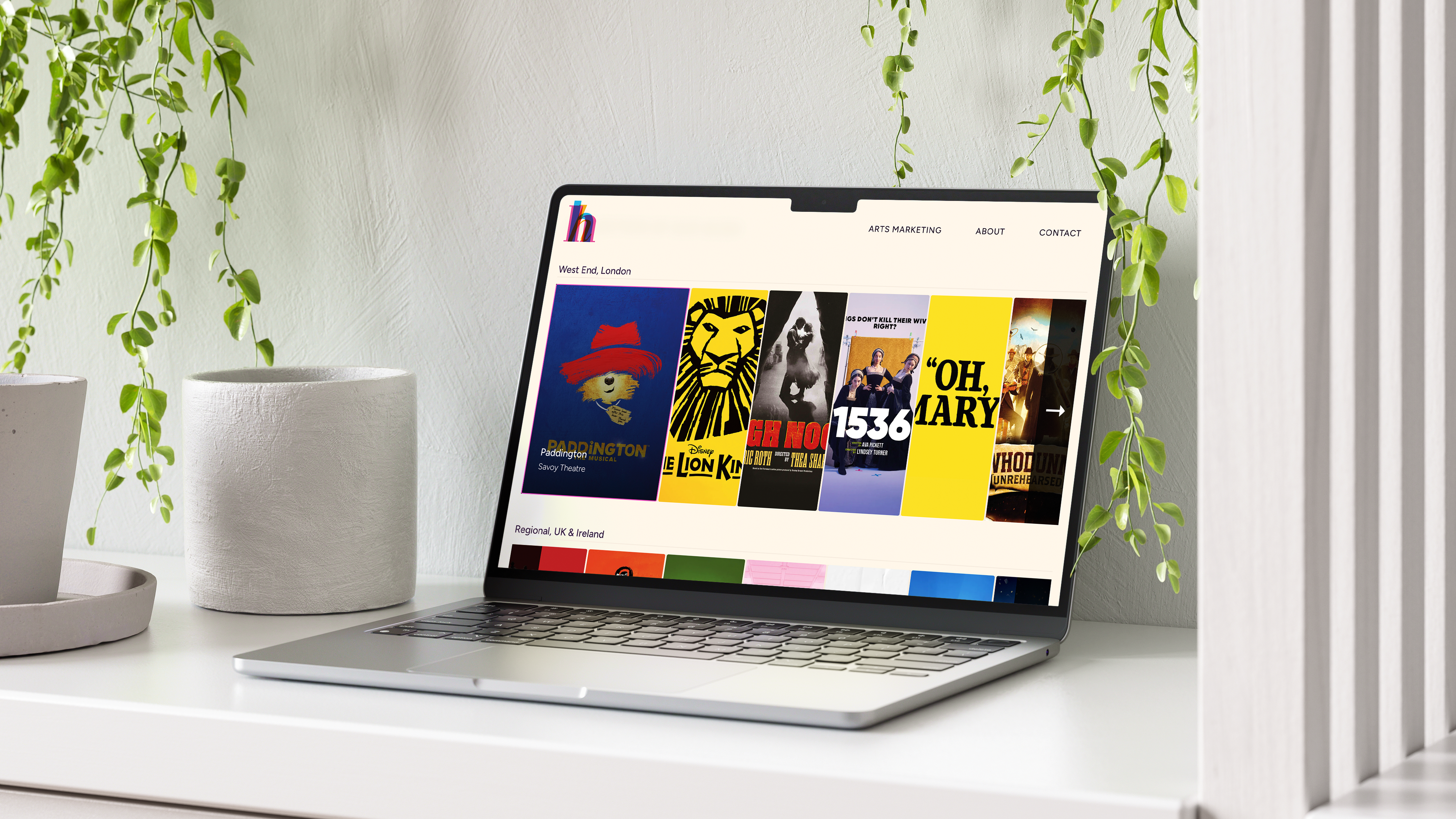
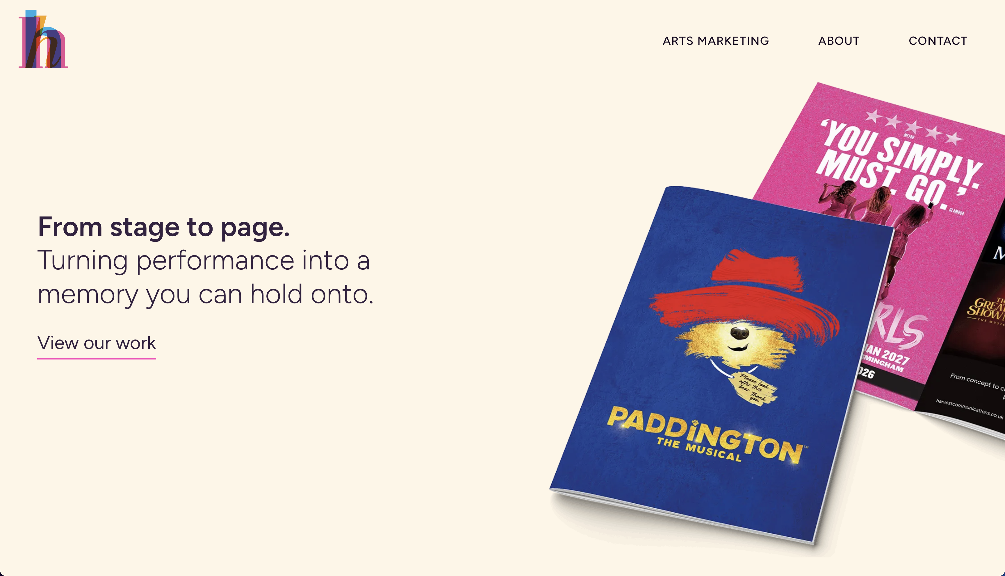
Harvest Communications produces theatre programmes for West End and touring productions, but didn’t have a website to show for it. I joined to design their site from the ground up, and loved getting to shape everything from site architecture to UX and UI, taking it from a completely blank canvas to a live site.
A specialist agency with no digital presence.
Harvest has been producing high-quality theatre programmes for years (for shows including Paddington the Musical), but had no website to signal that quality to the outside world. The brief was open-ended: build something that represents who Harvest is and where it’s going, for the specialist B2B audience who’d be looking at it.
Designing for a specialist audience.
With no existing site to react to, I started with the audience: arts marketing managers and producers who already know Harvest’s work and don’t need persuading, just reassurance of quality and a clear way to get in touch. That shaped how I approached navigation, layout, and tone across the site.
From there, I made three structural decisions:
- Focused navigation: Arts Marketing, About, Contact. No noise. Built for a specialist B2B audience who know what they want and don’t need to be sold to.
- Work-first layout: Programme photography as the visual hero on the homepage, letting the quality of the output speak before any copy does.
- Editorial, content-led structure: Pages built around large imagery and confident typography, so the site reads like a portfolio rather than a corporate brochure.
From no presence to live site.
The site is live. Harvest Communications now has a digital presence that matches the quality of its work, and a platform to build from. Upcoming phases include a full work showcase, client case studies, and a streamlined enquiry flow.
This project is ongoing, which I really enjoy: every design decision I make goes straight into production, gets tested by real users, and I get to keep learning from how people actually use it.
What this project demonstrates.
End-to-end design ownership: Site architecture, UX, and UI for a brand-new digital presence, from first sketches through to a live site. No handoff, no gaps.
Design with implementation in mind: Decisions were made knowing they’d go straight into a live build, so the design holds up in the real world, not just in Figma.
Strategic UX for B2B: Focused navigation, clear value proposition, and a work-forward layout designed specifically for a specialist B2B audience making procurement decisions.
I’m proud of how far this has come from a blank page, and excited for what’s next as the site grows.